Role: Sole Researcher & UX/UI Designer
Timeline: 3 months (Jul - Sep 2021)
Tools: Figma, Photoshop, Illustrators, Mural
Overview
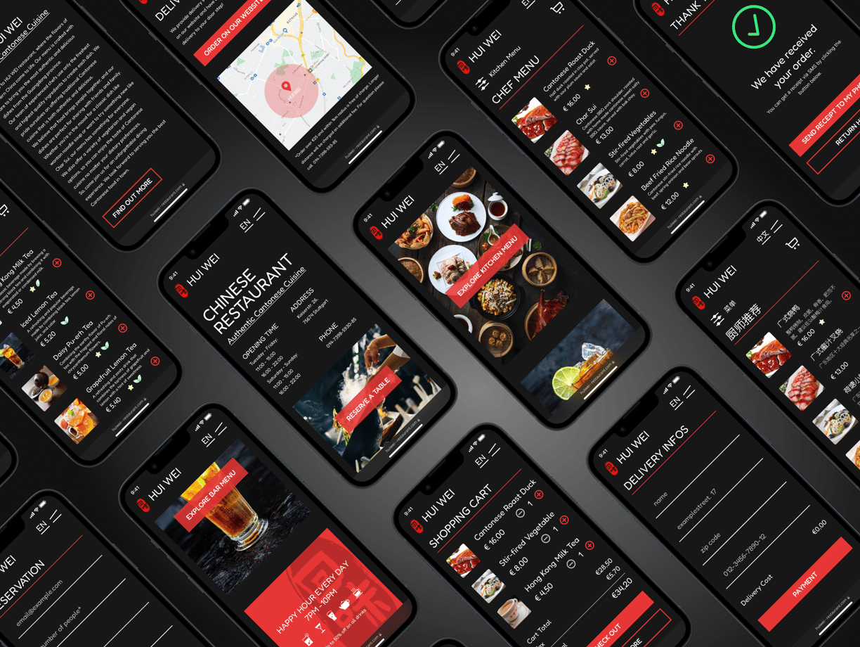
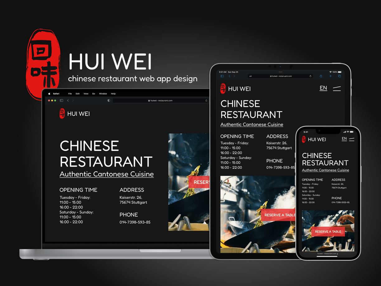
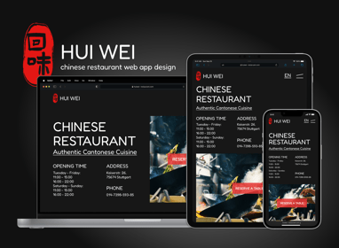
This project aims to redesign the web app for the Hui Wei Chinese Restaurant, providing its customers who come from different cultural background, with an enjoyable and seamless experience in ordering food, making reservations, and discovering the restaurant's offerings. The restaurant is located in the city of Stuttgart.
It features 3 key functionalities: multilingual interface and menu, an intuitive online ordering and reservation system and menu filter and food tags.
The Design Thinking Process
Adapted from Nielsen Norman Group


Competitor Audit
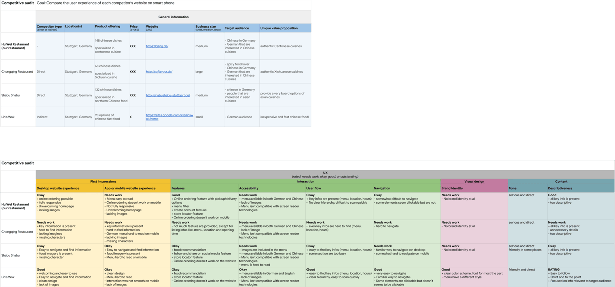
The first step I took is to conduct a competitor audit. I analyzed the web apps from 4 restaurant in total, including our restaurant Hui Wei; 2 direct competitor: Chongqing Restaurant, Shabu Shabu; and 1 indirect competitor: Lin's Wok.
I rated the web apps of these 4 restaurants in 9 UX aspects by using 3 scales: Good, Okay, Needs Work; and wrote down the reasoning and details comparison as well.
This helped me to identify the strengths and opportunities for our own app.

Interview
In order to better understand the customer's needs and goals when using web apps from Chinese restaurants, I recruited and interviewed 10 customers of the Hui Wei restaurant with the help of the restaurant manager; among them, 6 are regular customers; I also chose 5 customers that have chinese backgrounds as the restaurant manager told me that half of their customers are chinese. Other criteria in the recruitment process like gender and age are also considered.
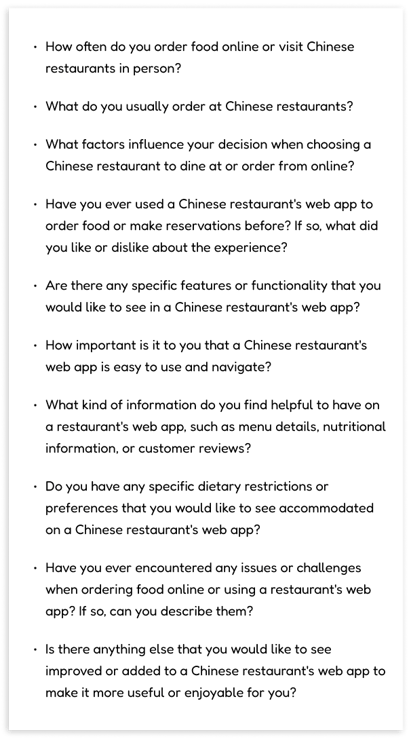
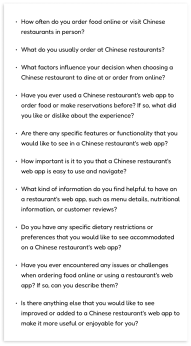
I wrote down 10 questions beforehand and use them in each of those 10 interviews. I also asked the interviewees to provide me with some basic personal information as well.

User Personas
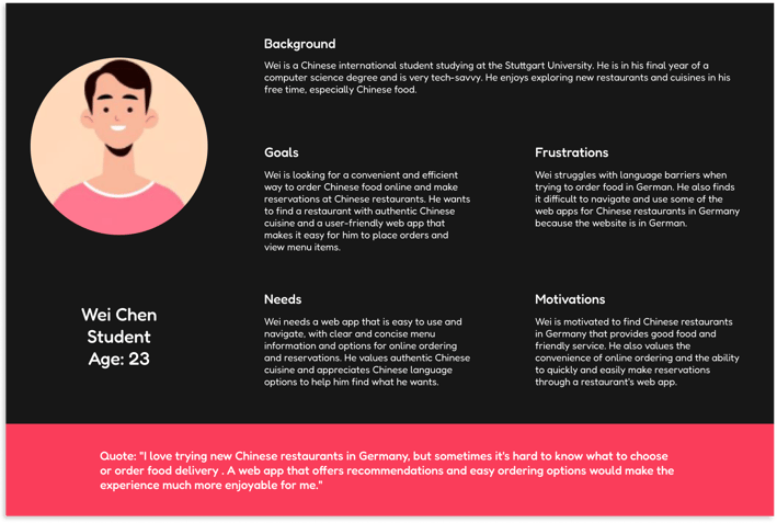
By analysing the notes that I took during the interviews, I then created 2 personas that helped me paint a clear and realistic picture of user's goals, needs and behaviours.

Minimum Viable Product
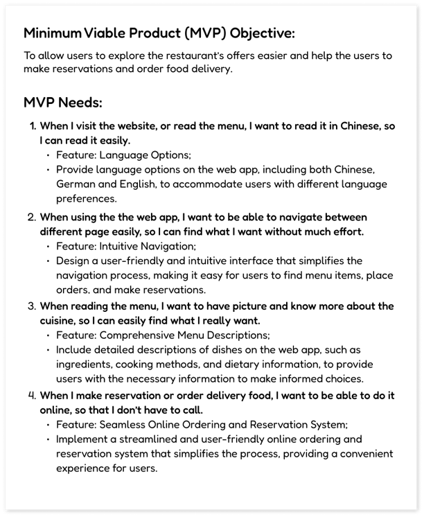
Next, I gathered requirements to define what features I needed to design for my app. I developed key user stories from my personas and minimum viable products (MVPs).
The MVPs would allow me to quickly test my initial designs on users, giving me valuable feedback early in the design process and to address any concerns right from the beginning.
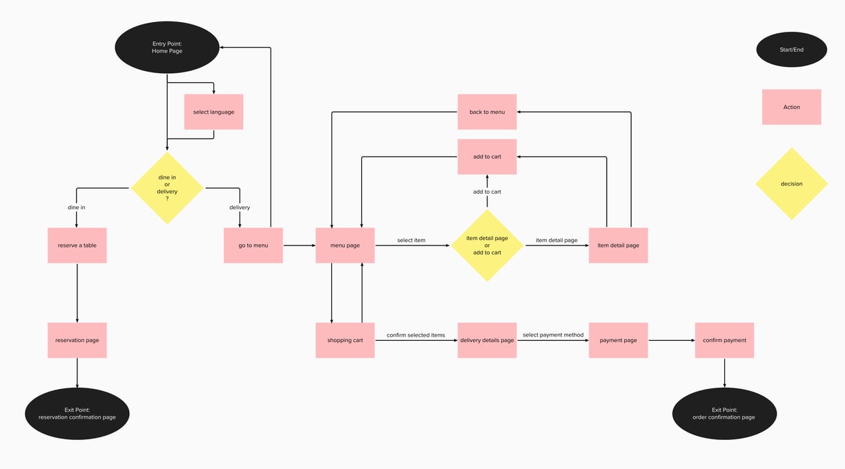
User Flow


Site Map
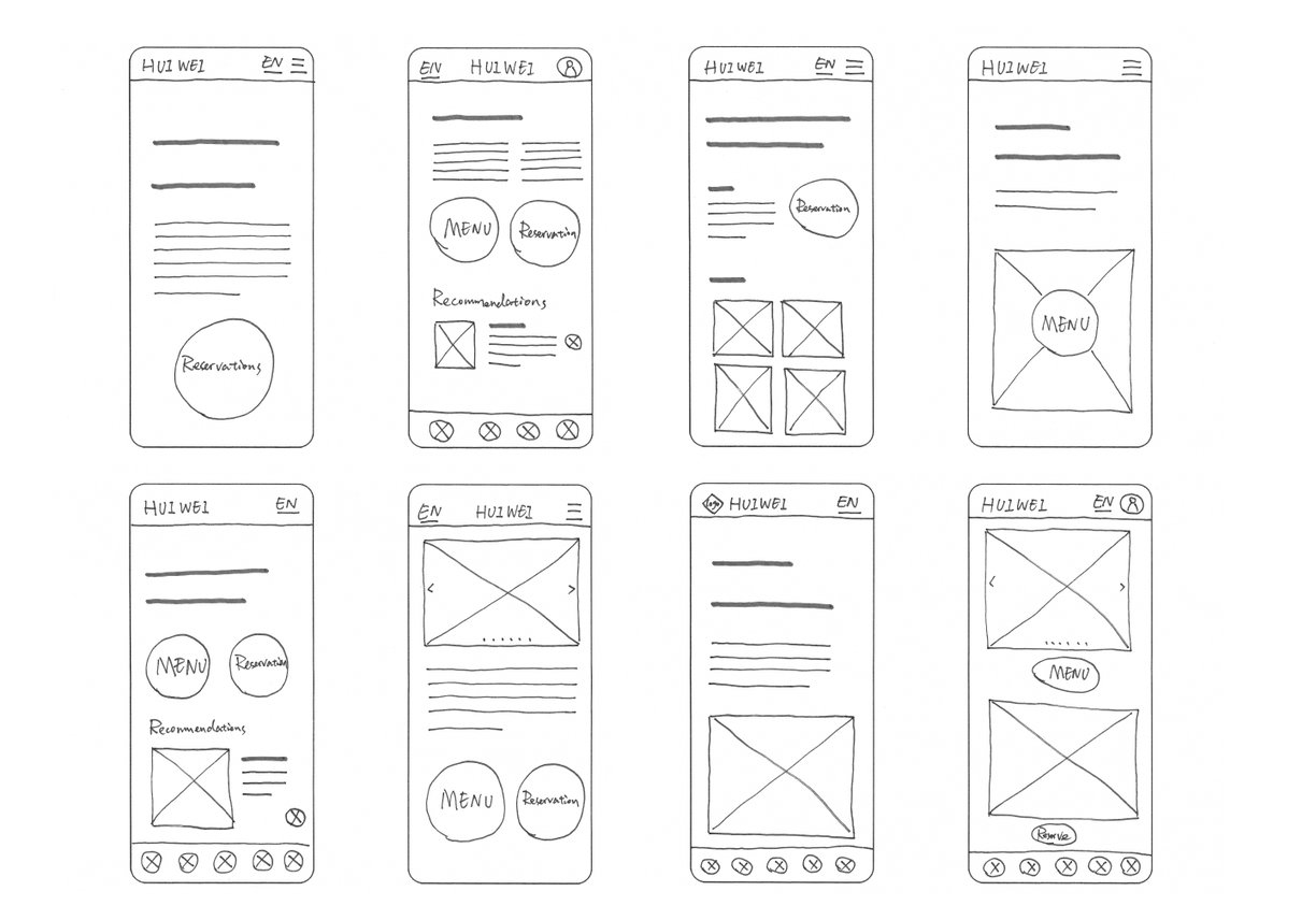
Crazy 8's Wireframe
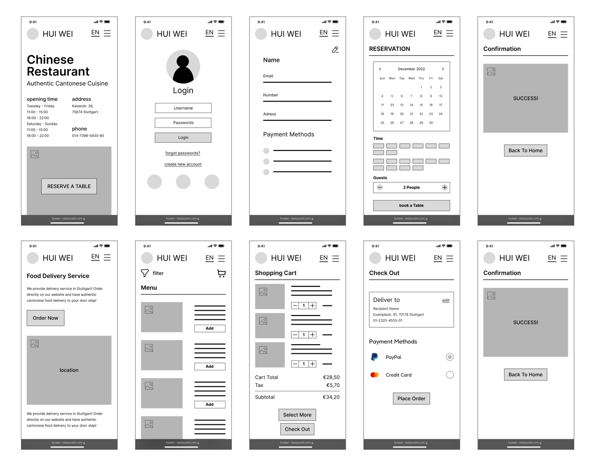
Prototype
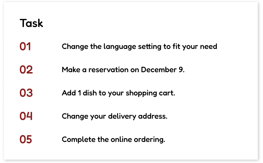
Usability Testing
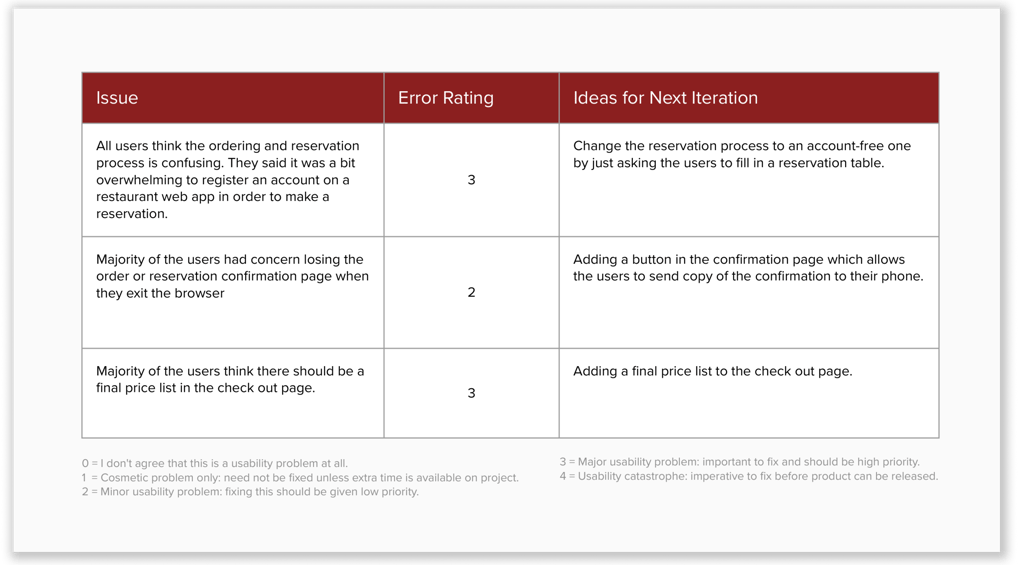
Using my prototype, I recruited 5 participants to conduct a moderated usability testing on my design. During the test, I asked them to complete a series of tasks that helped me to understand their thought process and see if they could accomplish the MVP goals. I also asked what they like or dislikes of the prototype.
Using my prototype, I recruited 5 participants to conduct a moderated usability testing on my design. During the test, I asked them to complete a series of tasks that helped me to understand their thought process and see if they could accomplish the MVP goals. I also asked what they like or dislikes of the prototype.
Design System
8-Point Grid
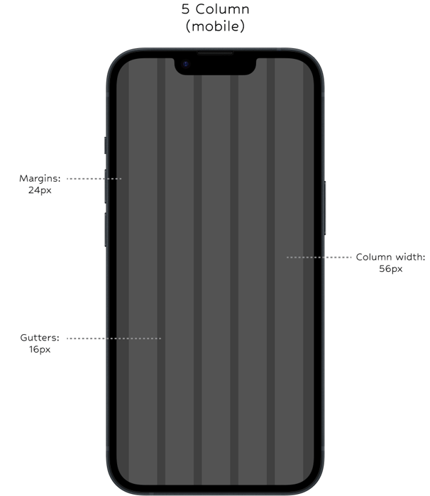
With a mobile-first approach, I used a 5-column, 8-point grid system as the foundation of the design system. It helped defining the spacing between UI components, and the 8-point grid is also applied to the typography and iconography system.


Typography
The Fredoka font is used across the brand. It is a san-serif typeface, which give the brand a clean and modern look. At the same time, it is also a big, round bold font that add a little fun to the brand identity.
For typography measurements, I used the 8px system for the line height to ensure a harmonious spacing that was pleasing for the users and scalable for web development.

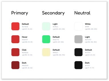
Color Styles
Iconography
Like typography, I used the 8px grid system for the iconography as well. I sized the icons proportionally, with the height as a multiple of 8.
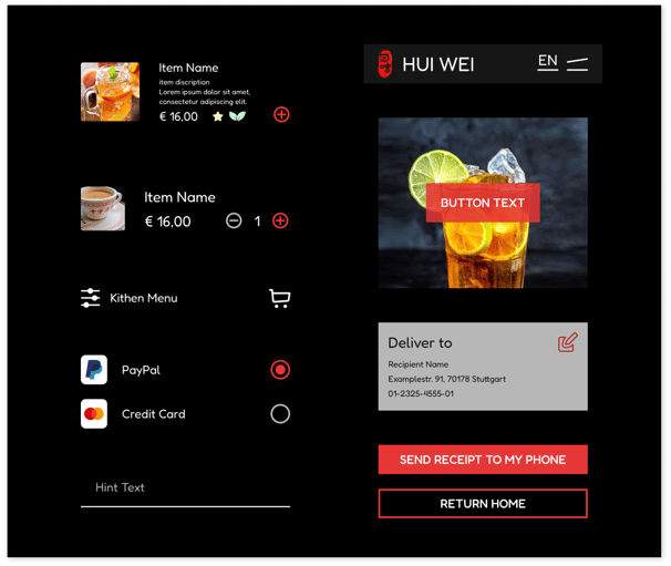
UI Components
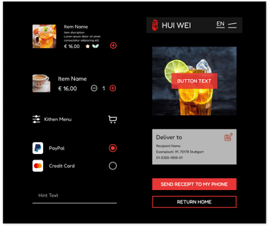
Based on the typography, color styles and iconography, I created UI components that would later assist in building pages in a consistent and effective manner.
Final Showcase
